Tuesday, December 20, 2016

The bright new future of compositing is just around the corner.

2017 will be the beginning of big things for LayerCake and StudioMagic. Up until now, StudioMagic’s Compositor library has been limited. The reason for this is the more elements like lightning bolts, birds and clouds that are added, the larger the application becomes, slowing it down, taking up users hard drive space and making for huge downloads. In 2017, all of that will be housed on a cloud.


An unlimited cloud-based library of cutout/masked accent images can be accessed through StudioMagic’s Photoshop interface and mouse-clicked into users photographic composites. StudioMagic can also simplify complicated Photoshop tasks like cutouts/masking, creating realistic shadows, creating water and mirror reflections, seasonal and weather changes, adding interior and exterior lighting effects and preset adjustments for light balance, tonal contrast and special color presets.

Al and I started LayerCake in 2009. We were spending our weekends shooting at arboretums, gardens, and on roadsides, picking up shots of trees, flowers, plants, animals, skies and clouds. We’d then go back to the studio and mask them out of their backgrounds. A small part of that library became the Master collection, some became the Compositior tool in StudioMagic 2 and the rest of the library was placed on the shelf until we could find an easier way to use and deliver them to our customers. Now we have!


In mid to late 2017, our element library will be accessible to our users via the cloud, easily downloaded and automatically installed into your new SM-2017 panel for Photoshop. All StudioMagic 1 and 2 tools will be upgraded and combined, plus some exciting new ones added. 


More big news, our new website will be launched in 2017 as well. It’ll be way faster, easier to navigate. We are also adding a social network of image compositors where you’ll be able to trade tricks with other members, show off your work, add links to your website, and get regular advice from the pros. 


We are creating an affordable subscription plan for members who want more in-depth training and special member discounts, on both StudioMagic products and our partners in the industry. Lets not forget our monthly newsletter and free webinars.


Harry Kerker is the president and a founding partner of LayerCake StudioMagic. 

He can be reached at harry@layercakeelements.com or 818 542-3500
Website: LayerCakeElements.com


Friday, October 7, 2016

Creating Your Own Virtual Studios

Hey folks, Peter from LayerCake/StudioMagic. Have you ever wished you could instantly be transported to scenes that would make awesome environments for your subjects? Wait till you hear what Harry Kerker, President of LayerCake/StudioMagic has to share with us today. Here's Harry.


People ask me all the time, what’s the difference between virtual studios and backgrounds? Backgrounds have been around a long time; there are millions of them to choose from. They’re usually splashes of color, graphic designs or wallpaper patterns that were generally used as backdrops to spruce up portraits. Virtual studios are the product of the new compositing craze because the CutOut process has become so much easier with the advent of StudioMagic. I like to refer to them as little movie studios since they each tell a story about the subject that can’t be told with a tired old background.

Virtual Studios are everywhere!

If you walk out your front door right now, I guarantee you there’s a virtual studio out there waiting for you. All it takes is opening your eyes and to think a little bit differently about how you create images. There are hundreds of graffiti walls like this in every city. The Mission District in San Francisco has hundreds like this one. Remember to leave some foreground so you retain the image depth.


I recently visited Memphis, Tennessee, I parked my car and this wall was facing me. It took all of thirty seconds to add this alley to my collection. Some High-school senior will love this!


How about this wall covering a construction site?


Perfect for kids, look at how the ShadowCaster shadow anchors the kid’s feet to the street.


How many times have you walked into an ornamental garden like this and thought what a great place it would be to shoot a wedding? Unfortunately most weddings take place in sterile banquet halls so you have to drag the wedding party outside and grab what you can that’s green. Sometimes you get lucky; other times it’s dead and brown, or worse yet winter. If you had done a little creative thinking, you would have grabbed this shot like I did. Who cares if the sky is lifeless, I have StudioMagic and a great collection of LayerCake skies.


It took me longer to choose the right sky than it did to remove the old sky with my StudioMagic CutOut tool.


The bride? Photographed against the wall in the banquet hall kitchen! True story. So think outside the box… or in this case outside the kitchen. : )


How do I go about shooting my own virtual studios?

The most important thing to remember is to shoot promising locations at different heights, since you don’t know how they will be eventually used or what angle your subject will be shot at. So first shoot chest level, then low and high. Also remember it's nice to have some foreground in your shot, in the event that you want your subject to be full length from head to toe. Shooting your subjects should be the same, shoot multiple angels so you’ll have matching options that fit your virtual studios. By the way, remember not to worry about shadows, the ShadowCaster tool does an excellent job creating lifelike shadows that will tie the whole image together.


Sometimes you just have to leave it to us.

For those virtual studios that you just can’t grab on the street, check out our website for amazing virtual studios created by our imaginer Peter Hernandez!


Harry Kerker is the president and cofounder of LayerCake StudioMagic and can be reached at harry@layercakeeelements.com

Lean more about StudioMagic 1 & 2


Thursday, September 15, 2016

Giving Your Sports Images an Extra Edge


Here again with this month's blog is StudioMagic's President/Co-founder, Harry Kerker.


Team Sports photography has become a big business and perhaps the most competitive with the advent of the auto DSLR, which almost anyone can get a good exposure with. So what kind of edge can you get over these auto shooters that will make your images stand out? The newest look in sports is the edgy grunge style. You see it on sports magazine covers, on the web and in movie posters. Most times it goes a step further, when the subject is placed in a cool location like a locker room or an old sports stadium. We’re going to discuss the process of creating these cool new images along with some help from our favorite Photoshop extension, StudioMagic.


I’m starting out with my finished image. Pretty gritty huh? I created this image in about five minutes; most of the time was spent experimenting with the level of Grunge Boost I wanted to apply. 


Step #1. Although it’s a good idea to shoot your players on a solid background to make the selection easier, if there’s good separation between the subject and the background it doesn't matter that much. 


Step #2. Remember, there always needs to be a clear distinction between the edges of the player and the colors in the background. Obviously if the catcher’s chest protector is black and the background were black, there would be no edge to select. In this case the background is green so I have a clear edge to select. I have my StudioMagic 1 panel open and in this case, I’m using the quick select brush, if the background were solid, the magic wand tool, would make a faster selection. 


Step #3. Once you feel you have a good selection, just hit the “Q” key on your keyboard, which will take you back and forth between the mask and the selection. Work on adding to or subtracting from your selection until it’s as clean as you can get it, then hit “Q” to get back to the selection mode or as some people call it the dancing ants around the subject.


Step #4. Select “Detailed CutOut” in StudioMagic 1 and the red mask will appear again, do a swipe with a medium size brush around areas with small details that you weren’t able to select, like around his mask and the leather ties on his glove, them hit the Detailed “CutOut” button and your subject will be automatically cut out and placed against a gray background. Your original image will be behind it, in case you need it at a later date. 


Step #5. Choose a background from yours or LayerCake’s library of sports locations. Be sure you choose a background where the angle and point-of-view matches your subject’s as closely as possible. This ordinary high school dugout is photographed about chest high. 


Step #6. Open StudioMagic 2 and the HyperZap module. Select “Grunge Boost” select the “Entire Image” radio button and hit the “Create” Button. Apply more or less Intensity and saturation with the sliders and hit the update button to apply your latest changes until you get the look you are looking for.


Step #7. Open your cutout catcher in another window. If it’s stacked in tabs, pull the catcher tab out of the grouping so it creates it’s own window, then place it next to your background image. With your layers pallet open, drag the cutout catcher layer over into the background image. Resize your player the size you want it by hitting “Command T” on a Mac or “Option T” on a PC. A box will appear around the catcher, with the shift key held, grab and anchor point and slowly drag to resize. Holding the shift key keeps the image proportionate as you drag. Sometimes the box and anchors will be off the page, to see the entire box and four ancors, hit “Command O” on a Mac or “Option O” on a PC.


Step #8. Select your catcher layer and go back to Grunge Boost. This time activate the “Selected Subject” radio button. Match the player to the look of the background by sliding the sliders and hitting update until you like it. Now you could have applied Grunge Boost to the entire image in one application, but I like to apply them separately so I can get the perfect balance. Lastly use the LightBrush tool in StudioMagic 1 to make the player stand out, and maybe add a little LightBurst from StudioMagic 2 for some extra drama!

Harry Kerker is the president and cofounder of LayerCake StudioMagic


Lean more about StudioMagic 1 & 2

Thursday, August 18, 2016

The Power of Light!

Hello StudioMagic Peeps. I hope you're enjoying the summer and that you're making lots of cool digital art. Here again for this month's blog is Harry Kerker, StudioMagic's President.

Creating dramatic images is all about light. Light can create power, inspiration and spiritual moments. Light creates focus, attention and drama. Needless to say without the power of light, your images can be flat and lacking of visual impact. But how do you do that when your capture is as flat as a pancake? Let’s create some light of our own!


Let’s start with a landscape. I remember pulling my car over when I saw this, then climbing over a barbed wire fence and down a hill into the field. Off to the right of the image there was an amazing sky approaching and so were loud thunderclaps and lightning. I was not going to wait for the sky standing in the middle of a field like a lightning rod. I knew if I got back to my car and waited, I’d find a safe time to get out and shoot the dramatic sky without being electrocuted. Once back at my studio, the first thing I did was pull up StudioMagic 1 with it’s CutOut feature to remove the old sky.


The CutOut feature does a wonderful job of simplifying Photoshop’s refine edge settings so I don’t have decipher the myriad of options for removing something as detailed as trees from a sky. There are a lot of good applications on the market for sky removal, but I found many to be complicated. I like the CutOut tool because it works hand and hand with the best one, Photoshop’s refine edge, it just simplifies it down to something we can all understand.


Now with my sky removed, I can replace it with the one that I actually saw. Interestingly enough, summer thunderstorms in Pennsylvania come and go quick, so it’s not unusual to see the storm pass and sun breaking through in the distance. However I was not able to capture fully what I saw, the sun bursting through the treetops and spilling into the field.


This is where StudioMagic 2 comes in handy. It was created as a full compositing tool for adding important accents to your images with a few clicks of the mouse. The LightingEffex tool has a full selection of light bursts and light rays to choose from that are automatically placed into your image. In this case I chose the burst that was as close to what I saw when I photographed the sky. You can make your own light bursts if you have the time and ability, but these are a fantastic starting place and you can reshape and color them to fit your image without much problem.


Once the burst was placed, I resized and rotated it to fit the placement I desired. The original burst was too white for the overall coloration of the image, so I used the ColorMatch (local) tool in LightingEffex to warm it up to match the ambient light. It was still missing the bright center light I saw, so I selected the burst layer and duplicated it which brightened the whole burst which I didn’t want. I wanted only the hot spot to be bright and the tailing streaks to be lighter and transparent. So I rasterized the duplicate layer and erased off the streaks which reveled the lighter streaks on the layer below. If you look back now at the top original image, you can see now what a difference light can make.


I’m always looking for locations like this to place models. However without the light streaming through the window and hitting the floor as it is, it wouldn’t be much but a room full of rubble. When you shoot images like this you also want to capture that dramatic shaft of light from the window to the floor but it doesn’t always happen. Light does not have color, what you see in a light shaft is the dust in the air being lit.


Honestly being a compositor and not having the light shaft is a blessing in disguise. I want to have the option to place a light shaft on the layer behind the subject and a shaft on the layer in front to create depth. In this case I started by using StudioMagic-1 to CutOut my subject and add a shadow using ShadowCaster to match the long light cast by the window. Once I placed the shadow, I used transform to stretch it even further to match the direction and length of the light.


Using StudioMagic 2, I chose the “Smokey Dust Window light preset, which was automatically placed behind the subject. You do this by choosing the subject layer before you place the light shaft.


Light shafts and rays are starting points; rarely in interior situations like this do they fit perfectly. You will need to use the transform and distort tools to pull, stretch and distort a light shaft to fit the window shape and the length of the light. Once your shaft is sized correctly, open the light ray folder in your layer pallet, select the light ray layer and right click on it. Choose the option to rasterize it, which will give you the ability to trim the light shaft with your lasso tool to fit the shape of the window frame. 


Finish off your composition by placing the same light shaft preset on the layer above the subject and using the same steps above to make it fit the window. Amazing what StudioMagic and the power of light can do for an image.


StudioMagic 1 & 2 for Photoshop are compatible with Photoshop CS 5 through CC 2015.5


Tuesday, July 26, 2016

Virtual Studios: "Surf's Up" & "On Track"

Hello my fellow StudioMagic compositors! I'm honored to once again have Harry Kerker, President of LayerCake/StudioMagic with us today. He's going to be sharing two exciting ways to help put the impossible at your fingertips. Your imagination will run wild with what he's about to show you so hang on! Here's Harry.

Opening up a world of possibilities with StudioMagic


Prior to the advent of Photoshop, the image you captured through the lens was what you got. And if there was a subject involved, it required a lot of setup and prep to get both the subject and the environment to work in the same capture. I remember as a young art director working with the famous Reid Miles in Hollywood. Reid made a living on recreating Norman Rockwell in photographs. His technique was to shoot his subjects individually, take the Polaroids and make elaborated collages pasted together. Then he’d send them out to a retoucher who would make the prints and assemble them. The result was great, but it was time consuming and very costly to convince a client to spend the money on. Today Reid would be a Photoshop and StudioMagic advocate. All the things he so painstakingly created, can now be done on your desktop with StudioMagic. 


Photo Credit: Reid Miles

I’ll be using a few examples of our virtual studios, Surf’s Up and On Track. Neither of these could have been created without the use of Photoshop and StudioMagic for obvious reasons. I challenge you to think outside the box from now on just like Reid did. With StudioMagic you are no longer a prisoner of your studio, your only limitation is you imagination.

All good composites begin with a good cut out subject. In this example the young lady is photographed in a studio against a neutral gray background. Now a studio is great, but not necessary, a wall in your garage could suffice. The point is the simpler the background the easier it is to separate your subject from the background. You want to have a good clean delineating edge between her and the backdrop for the masking tool to read. No worry about the flying hair, the StudioMagic CutOut tool has no problem with that. StudioMagic’s CutOut tool will work with more complicated backgrounds, but if you’re starting form scratch, why not make it easy on yourself.


It’s clear in this next example that simplifying the background make the background selection process a lot easier. The StudioMagic CutOut panel has been pulled up and we’ve selected “Detailed CutOut” to pick up the flying hair and a ProMask incase we want to do some touchup work on the final cut out. You’ll notice that I have “Detect Outside Edge” selected as well, because in this case, we’ve selected the background and not the subject. I prefer seeing the red background under “View” in the refine edge panel. Once you are happy with you selection hit ok and your surfer girl is cutout and placed on a gray background ready to move into your Surfs Up virtual studio. The question always arises, “Why do I need this I already have refine edge in Photoshop? The reason being that refine edge is complicated and difficult to master. So we went to a panel of industry experts who determined the best possible defaults for compositing and we built them into the CutOut tool so all you have to do is click a button for great results.


The next step is getting your subject into the virtual studio. You can do this a couple of ways, first a simple selection of your cutout subject then copy and paste into the virtual studio. Another way is to place you subject and your virtual studio side-by-side on your monitor and drag the subject from one image into the other.

The examples below:
  1. Is a Surf’s Up Virtual Studio in its default stage. 
  2. We’ve copied in our surfer girl, rotated her correctly and sized her according to the size of the surfboard. This is a logical guess based on knowing how wide a surfboard generally is and the size of her feet.
  3. Shadows are highly underrated, without a shadow the girl looks pasted in. StudioMagic’s ShadowCaster makes perfect shadows that can be adjusted to the direction of the light. In this case the light is hitting her front on at a slight angle over her shoulder, the shadow is adjusted to match the direction of the light. Now she’s anchored to the surfboard.
  4. The final touch is the ocean spray that is provided as an extra in all the Surfs Up studios. Move the spray over her body and feet and it holds the entire image together. 

Now keep in mind, these types of images are supposed to be in fun and they have an illustrative feel to them. They are great for high-school seniors, kids and people of all ages who love something different.


OnTrack

Believe it or not, portraits on railroad tracks are extremely popular and dangerous as well. Here’s how you take the danger out of the process and get the same fun result. The process is the same, as with Surf’s Up so we won’t go into the detail.

Select your subject with the magic wand; you’ll see the dancing ants around it.  Select “Detailed Cutout” and refine edge appears. Go in and out of refine edge by simply canceling it, which allows you to repair areas in the selection that you may have missed. Once ready hit “Detailed CutOut” again in order to see refine edge. Keep doing this until the subject is selected as well as possible. The red overlay will show you what’s missing and what needs to be added to you selection. The selection tool changes from add to subtract with the option key on the mac and the alt key on the PC.


Final step, copy in your CutOut subject, add a shadow with ShadowCaster and you have a super portrait in minutes that without StudioMagic would have taken you hours and perhaps gotten you arrested for trespassing on railroad property! 


StudioMagic simplifies many of Photoshop’s most difficult tasks and reduces them to a few mouse clicks. It’s used by professional and novice Photoshop users around the world. It’s not necessary to own our virtual studios, you can make your own with StudioMagic. They just provide a nice starting place and an easy way to learn compositing without starting from scratch.


So there you have it. StudioMagic with Surf’s Up and OnTrack virtual studios. Tons of different scenes in this package and a bunch of new ways to make some cool composites. Get creative and happy compositing!


Monday, May 9, 2016

Virtual Billboards. Making Composites "Larger than Life!"

Hey Everyone. I'm back with another blog post today after having Harry Kerker guest blog the last couple of times. I'm going to be sharing a great way to showcase your clients and make them... as the today's title says, "Larger Than Life".  As usual, StudioMagic makes things real simple.

So, what comes to mind when we think of an impactful way to make an important visual announcement that all can see from near and far? A hint would be: "Will You Marry Me?" That's right. I'm thinking BillBoards! What better way to make your client, family member or friend the "Star of the Show" than to plaster them all over a billboard? Right? The good news is that you don't have to rent one, thanks to StudioMagic's PhotoBoards. Let's take a look at how simple it is to get someone you know up on their very own billboard.


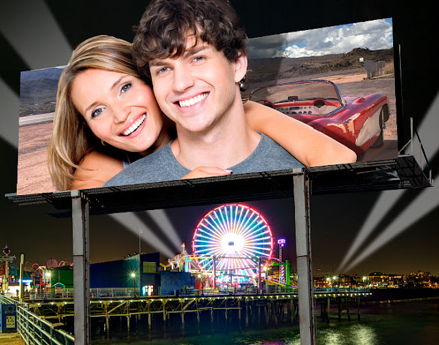
Above you see a finished PhotoBoard and the first unusual but totally cool thing you'll notice is that
the subjects are so (here it comes again) "Larger Than Life" that the edges of the billboard can't contain them. Let's see how we can produce this with the help of StudioMagic I and we'll even take it a bit further to knock it out of the park with a little "one-click" accent from StudioMagic II. Let's go!

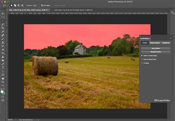
To start, we need to cut out our subjects from the original photo. Just a note that a simple empty background is best.  For that we'll go to StudioMagic I's CutOut feature. I'll open it up and using my "quick selection" tool in Photoshop, make a few swipes at the background so it looks something like this:


Once I've got all of the background selected, and judging by all the detail the edges have due to the hair, I'm going to click the "Detailed CutOut" button and make sure the "ProMask" button is checked. What that'll do is give us a mask when it's all said and done so we can have the luxury of tweaking the edges after the fact if we need too. Once we click "Detailed Cutout", the "Refine Edge" dialogue box appears. It may look complicated but StudioMagic 1 chooses the best settings for you to get you going...


...and this is what we get when we click "OK". If we like the quality of our mask, then we can right-click on our layer mask to apply the effects of the mask.  But hold off if it still needs a tweak here or there. Simply paint on the mask with white to reveal more of the photo, or less by painting with black. Then right-click on the mask and choose "Apply Layer Mask." The mask then goes "bye-bye" since its work is now done.


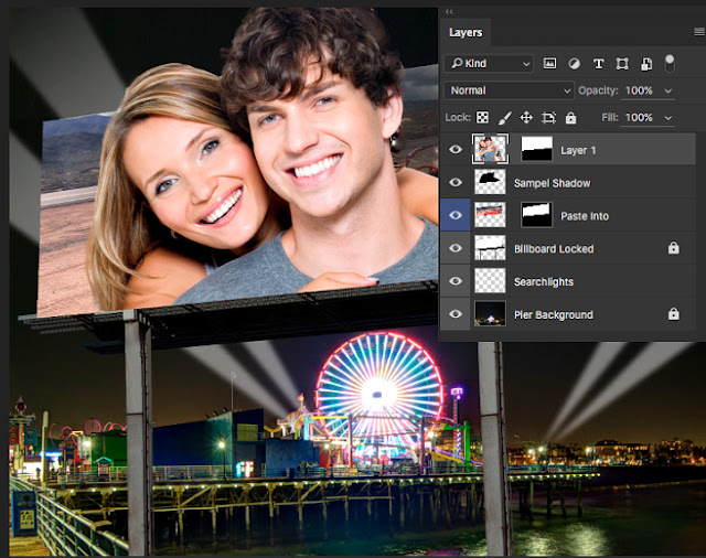
Note the transparent background of the subject layer when we chose "Apply Layer Mask".


Now with the layer of our subjects selected, let's copy the contents of that layer so we can paste it into the PhotoBoard image by going up the the "Edit" menu then down to "Copy". I prefer keyboard shortcuts so I use "control (pc) / command (mac) along with the "C" key but here's the menu:


Back in our PhotoBoard image, let's command/control click on the "Paste Outside" layer's mask. This will select the area defined by the mask and lets us see the space our models will occupy once pasted back in. Note the marching ants surrounding that space:


To paste the copied image on the billboard we do the following:


And voila! Into the PhotoBoard they go with their very own layer mask to prevent them from poking out the bottom of the billboard! See? Right there on "Layer 1". You can now resize using the transform tool (command/control "T") and/or move them with your move tool to get them sitting in the board just right.


Now as I mentioned early on, I said we'd use StudioMagic II at the very end to give this image a little something extra. So let's pop it open and spice things up just a bit. As I look at this scene, I'm thinking "night time" and what comes to mind?... the moon! So let's do it. Let's head down to the "MoonClock" section under the "Compositor" dropdown menu. I'll click "choose preset" and let's feast our eyes on all the various moon phases. Once I choose one, I click "create" and there it is! All that's left to do is resize by moving the "Resize" slider and "update" or if you prefer, with the transform tool (command/control "T") and drag the corner handle while holding the "Shift" key to keep the proportions correct. When done, hit "Enter/Return" and you've sealed the deal. We could even pop open the "Starry Night" dropdown and sprinkle stars all over the night sky with a single click but you get the idea. Let the image tell you what it needs and know that StudioMagic delivers!


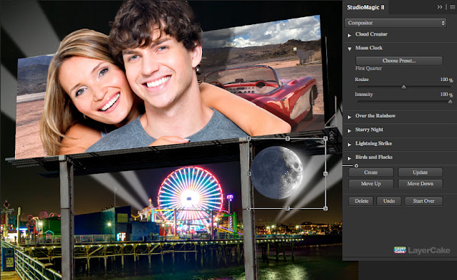
Easy. I told you! And here's our final image:


But is doesn't end there, folks. Remember that with the aid of SM I & II you can really take these images to a whole new place by applying your imagination. Think atmosphere as in sun, clouds, fog, painting with light. That and so much more awaits you. Oh, and I forgot to point out that yes, there is a shadow layer behind our subjects. As if extending beyond the billboard to make them pop out isn't enough, you could take advantage of the shadow, courtesy of StudioMagic I to make your models really jump out from the background even more.

So there you have it. StudioMagic PhotoBoards. Tons of different scenes in this package and a bunch of new ways to make some cool composites. Get creative. You could mix and match elements from the different scenes to create your own. So explore, create and most of all... Happy compositing!

To See tutorials on PhotoBoards, click here.